
There are those companies who hire a dedicated icon designer, and there are those who don't. I think the reason is the company's inability to afford to hire for the position. However, I fear that they are considered too trivial, "just download an icon set," they say.
If your design system contains two fonts, heading font and body copy, then icons are your third. Would you treat your heading font in the same way as your icons?
 Nordhealth
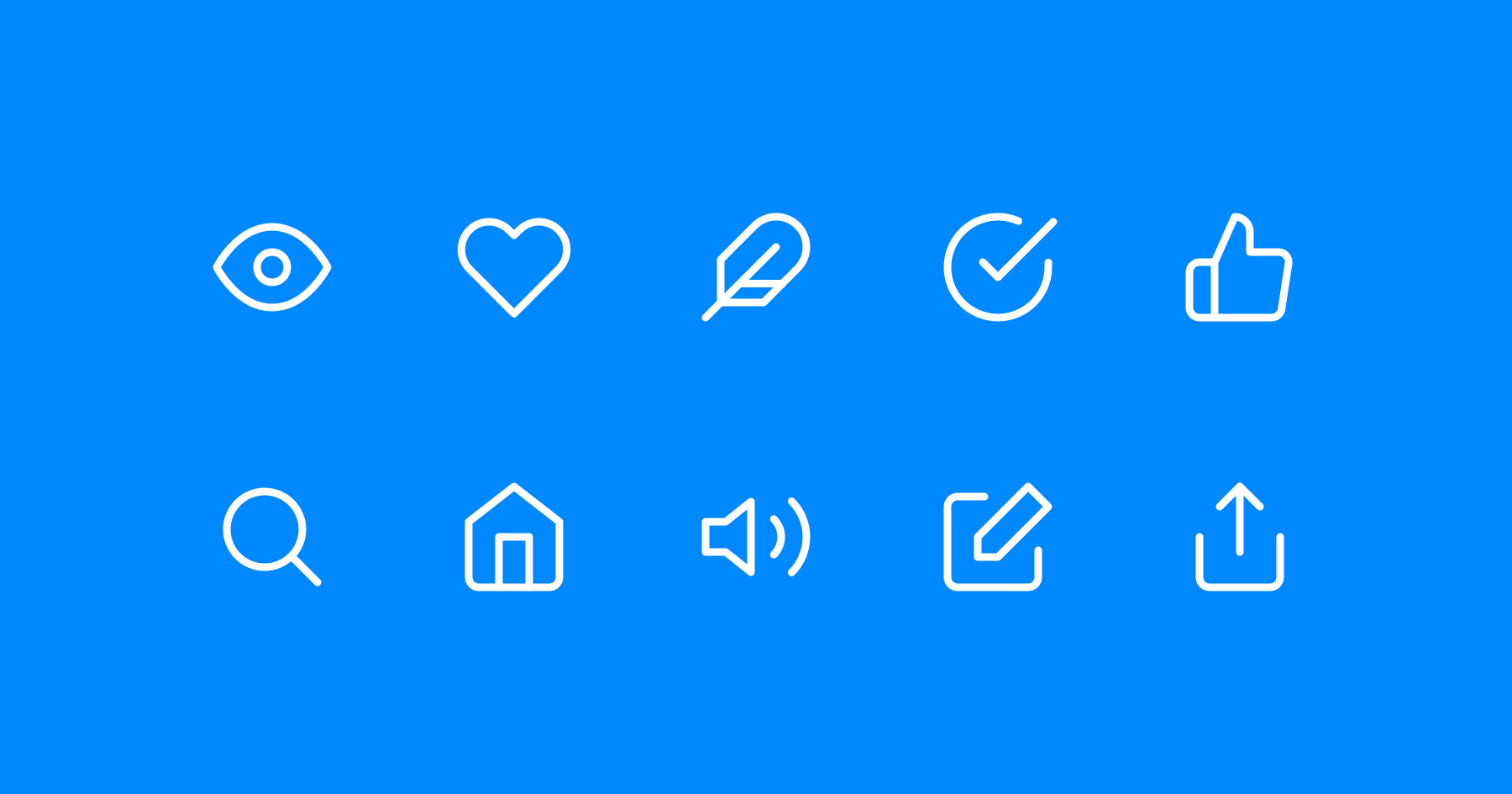
When I worked on Nord design system, we had the privilege of working with Ilkka Janatuinen from H23 Agency to produce a dedicated icon library, which we nicknamed "Nordicons."
There are plenty of other talented icon designers in the space as well, including Vic Bell, Gavin Nelson, Laura Bee, and Prekesh Chavda.
Alternative options
Ok, I'm not here to dunk on companies that can't hire icon designers. I'm just highlighting the value of icons themselves, well-designed icons.
 vkarampinis
Above is a fantastic directory of icon libraries you can browse through and use. Some are paid, some require attribution, and some are free for you to use.
My favorite is Feather Icons by Cole Bemis, who works at GitHub. What's clever about theirs is that you can customize the stroke width (line thickness) to suit your needs. Having this control, through the design and even in code, means you can easily adjust your iconography globally for possibly accessibility reasons or for changing their personality.

I'd probably take this approach if I worked with an icon designer on a new icon set. Once again, I'm drawing comparisons between fonts and icons, but font weights and icon "weights" in this instance. Very cool.


